CHIME: NEW PAYMENT SYSTEM


About company
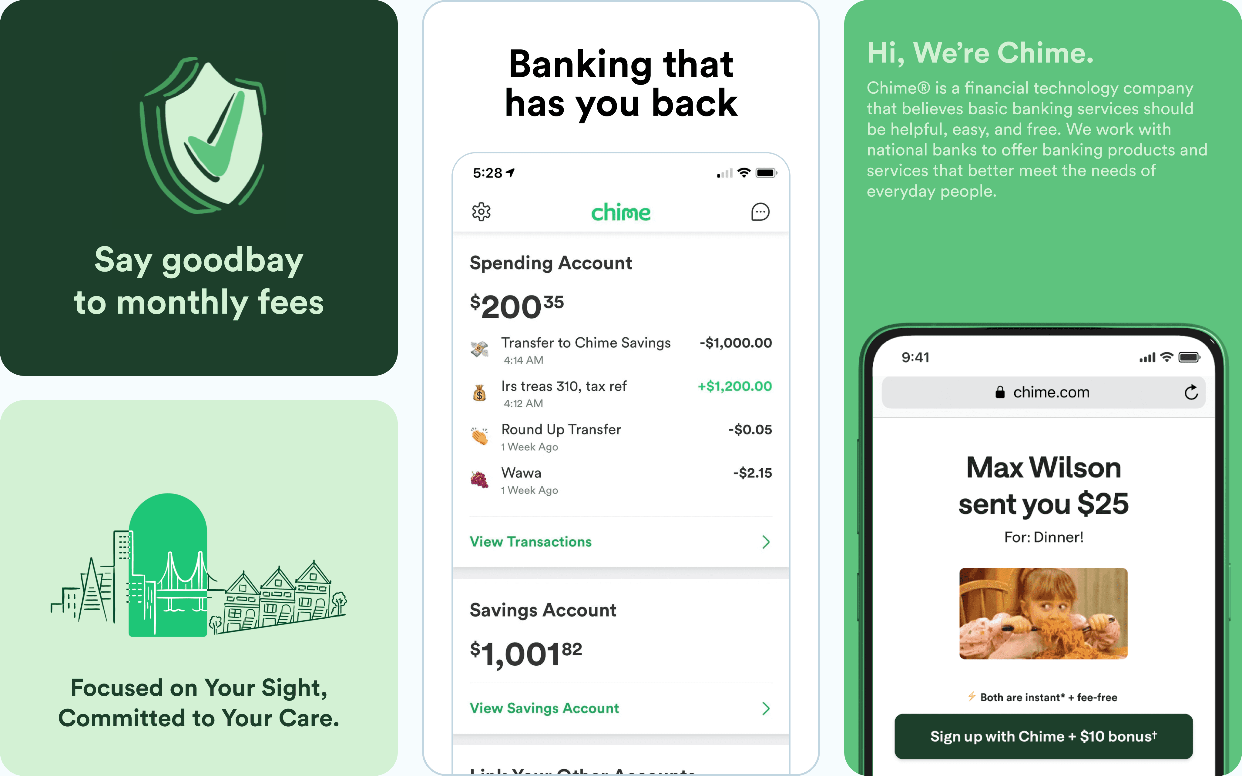
Chime is a mobile-first financial technology company serving over 14 million users who seek fee-free banking.

B2B
Fintech
overview
The Chime debit card mobile experience was redesigned to simplify card management and enhance user satisfaction. The project aimed to create a seamless, intuitive interface that empowers users to control their cards, track transactions, and access security features effortlessly. By leveraging user insights and iterative design, the solution improved engagement, strengthened trust in security, and provided clear financial insights for a more efficient banking experience.
Design Challenge
Chime needed to differentiate in an increasingly competitive neobank market where Cash App, Monzo, and traditional banks were offering more sophisticated card management and credit-building tools. With over 14 million users but declining app store ratings (3.2★) and a 35% activation abandonment rate, the card experience was directly impacting customer acquisition costs and retention.


Instant feedback
Every tap shows a state change: loading, processing, done. Users never wonder.
Reliability
Infrastructure ensuring 99.98% payment uptime.
Integration
Clear APIs, consistent logic, and docs that get you live fast.
Transparency
No hidden fees — you always know what you’re paying for.
E.Ideation and Brainstorming
After synthesizing research findings, I facilitated a collaborative ideation workshop with the cross-functional team to generate creative solutions for the three core problems identified. The goal was to move from "what users need" to "how we might solve it" through structured brainstorming techniques that encouraged quantity over quality in the early phases.

Design System
Rather than designing from scratch, I extended Chime's existing design system to ensure consistency across the new card management features while contributing reusable components back to the shared library. This approach accelerated development, maintained brand coherence, and enabled future teams to build upon these patterns.


Design Process: Turing ideas into reality
After ideation, I translated prioritized concepts into tangible designs through an iterative workflow—moving from low-fidelity wireframes to interactive prototypes while continuously testing and refining with users. This progressive approach allowed me to validate core functionality early before investing in visual polish, reducing costly changes during development.

Wireframes
Low-fidelity wireframes were created to map out the core functionalities and user flows for the debit card management experience. These included screens for card locking/unlocking, transaction history, and security settings. The wireframes focused on structuring information clearly and prioritizing ease of navigation, ensuring the proposed layout addressed user pain points and improved discoverability of key features. Feedback from usability testing guided refinements before progressing to high-fidelity designs.

User Flow
I created comprehensive user flows to map all possible paths users take through the card management ecosystem, identifying entry points, decision nodes, and success outcomes. These flows served as both a design planning tool and technical specifications for engineering, ensuring every edge case and interaction was accounted for.

High Fidelity wireframes
The high-fidelity wireframes brought the design concepts to life, incorporating Chime’s branding elements, a cohesive color palette, and clean typography. Key features, such as the card management dashboard, transaction categorization, and security controls, were visually refined for clarity and accessibility. Interactive elements, like toggles for card locking/unlocking and visual spending insights, were designed to provide an intuitive, engaging user experience. These wireframes served as the final blueprint for development, ensuring alignment across teams and a polished product for users.
Prototypes
Interactive prototypes transformed static wireframes into clickable, testable experiences that simulated the final product, enabling comprehensive usability testing and stakeholder validation before engineering investment. I created multiple prototype versions in Figma with increasing fidelity, each serving specific testing objectives throughout the design process.
Solution
The final solution is a unified card management ecosystem that transforms three fragmented experiences into one seamless journey—enabling users to activate cards in seconds, understand their spending patterns effortlessly, and build credit confidently. Each feature directly addresses the pain points uncovered in research while maintaining Chime's signature simplicity and accessibility.

Final Solution
The final solution delivers a seamless card management experience that reduces activation time by 68%, increases spending insights engagement by 3x, and boosts Credit Builder adoption by 43%—all while maintaining Chime's signature simplicity. Here's how the redesigned features work together to empower users' financial wellness journey.
Statistics
Performance by the numbers
Real operational metrics from live traffic — no marketing fluff.
$
M+
Monthly transaction volume
.
sec
Average processing time
,
+
Active businesses
.
%
System uptime

Key features
Built for fast, stable payments operations
Sivo provides the tools to run payments reliably, reduce operational friction, and keep your financial workflows under control.
Scalable architecture
Handles transaction growth without slowing down.
Real-time oversight
Instant visibility across operations for real-time insight.


Key features
Financial operations that stay fast and predictable
Our platform streamlines payments, reduces friction, and gives you real-time control.

Operational clarity
Real-time tracking and accurate reporting for every transaction.

Faster workflows
Automated steps that reduce errors and speed up your processes.